Rebranding Japan: Modern Japanese Design & National Identity
5.17.2017
In 1994, the Philadelphia Museum of Art put on an exhibition titled Japanese Design: A Survey Since 1950 showcasing what it considered to be “the first comprehensive survey anywhere of Japan’s original and important contribution to modern design.” Andrew Pekarik, in his review of the exhibition and its catalogue, notes that aside from the exhibition’s apparent “zenning” of Japanese design, which is problematic as it denies the agency of the designers, the catalogue provides a compelling narrative of individual Japanese designers “struggling to meet the demands of a consumerist system; while maintaining their individuality of expression and seeking a unique, national style.” The illustrious contemporary Japanese designer Hara Kenya summarizes this same struggle:
The history of modern design in Japan has been haunted by the question, ‘What is originality?’ repeated like a hiccup every time modernism from the U.S. or Europe is dropped into the gut of our culture. This particular inclination to contrast the originality of one’s own nation with Western identity or thought is a cultural trauma commonly found in Asian countries that have experienced the civilizing of their cultures in reference to Western modernity.
Japan’s contention with modernization-as-Westernization characterizes its history following the end of the Edo period’s sakoku policy from the Meiji period onward, and consequently the many aspects of its culture. Considering the dynamic of tension and mediation characteristic of Japanese culture by which it filters and absorbs foreign ideas, Japanese designers have managed to preserve and express a sense of unique national identity by drawing on their rich heritage to inform their use of modernism in design. Using brand design to define and redefine identity on both a national and international level in relation to the contemporary socio-economic context, they have distinguished the “meta-brand” of Japanese design from its Western counterpart.
The modern conception of design, including its related technologies and professional practices, was imported into Japan from the West. Prior to their encounter with Western culture in the mid-nineteenth century, the Japanese did not differentiate between “art made to be looked at and art made to be used.” During the Meiji period, in their quest to join the global powers as a modern nation, they began participating in international expositions as exhibitors. In preparation for the Vienna exhibition in 1873, they discovered separate categories for “fine art” and “applied art,” for which they coined the new words bijutsu and kogei, accordingly. However, with modern Japanese industry still in its infancy, the concept of design as a form of art understood by its commercial application would not be recognized until after the turn of the century with the emergence of new terminology such as zuan and dezain for “design,” as well as shōgyō bijutsu, meaning “commercial art.”
From the beginning, the practice and profession of design in Japan developed in response to periods of significant economic growth, first with Japan’s rapid industrialization then again with Japan’s post-war reconstruction. The need for commercial art and advertising first became apparent during the first three decades of the 1900s, roughly the period between the end of the Russo-Japanese War and the beginning of the Second Sino-Japanese War, as the Meiji government was mobilizing the country to modernize industry and engaging in its own imperial agenda abroad. The introduction of state-of-the-art technologies such as the rotary press and photography and the implementation of a nationwide education system in 1872 enabled the production and consumption of new forms of mass media. The rotary press made three-color lithography immensely more practical than relief printing, inviting enterprises to produce posters, thereby revolutionizing visual communication in Japan. Furthermore, this coincided with a shift toward product brand name recognition, facilitated by the ratification of a trademark registration law in 1884; from this point on brand image and management would become crucial to the commercial success of Japanese manufacturers.
Unfortunately for early designers, an extant subconscious hierarchy undermined design’s recognition. Commercial art typically was unsigned and thus went uncredited, largely due to the distinctions made decades prior between bijutsu and other forms of art. Emboldened by the celebrity status of Western artists, Japanese artists had been fighting for the social recognition of bijutsu as an intellectual pursuit so by the 1920s, reinforced by government sponsorship, a hierarchical mentality had been indoctrinated through the Japanese art community and its institutions. To make matters worse for designers seeking recognition, the bias against art of commercial nature was deeply embedded in the cultural fabric of Japanese society influenced by the lingering Confucian social class structure that placed merchants at the bottom rung. Conscious of their brand image, businesses would commission well established artists to paint works that would be printed as posters used for advertising in the hopes of associating their brand with the elegance of fine art while distancing it from notions of commerce. As a result, a common motif from the previous Edo period of Japan called bijinga or “pictures of beautiful women” figured heavily into the branding of companies in these first couple decades of the century; in 1903, Kirin Beer produced the first chromolithographic poster, opting to represent its product with an image of a Japanese woman.
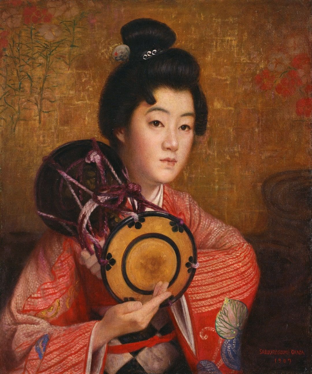
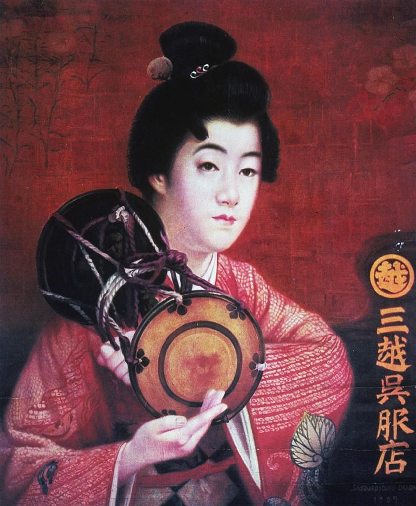
A leader in this style of branding, the Mitsukoshi department store reproduced the Western-style oil painting Portrait of a Woman from 1907 (fig. 1) by the oil painter Okada Saburosuke as a chromolithograph imitating the look of several layers of oil paint (fig. 2).
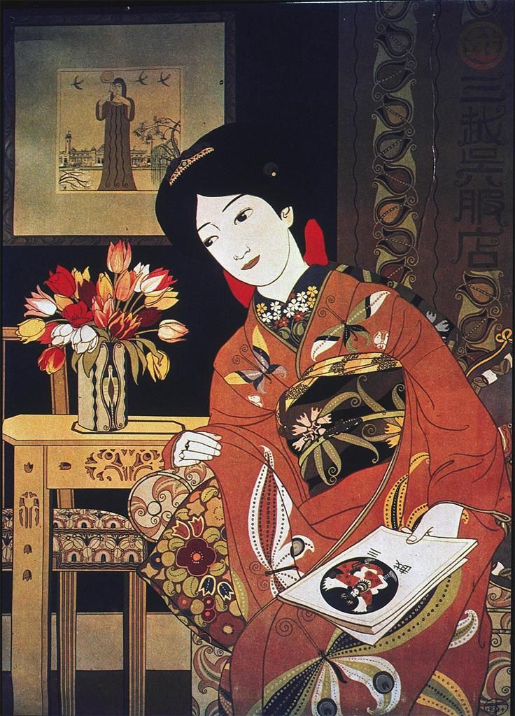
Seeking to marry its brand with this image further, Mitsukoshi held a bijinga poster design contest in 1911, won by Hashiguchi Goyo’s image of a kimono-clad woman (fig. 3). In keeping with the times, the art nouveau qualities exhibited by Hashiguchi’s “beauty picture” signify a slight departure from the oil painting aesthetic of Okada’s image, a trend that would be continued by Mitsukoshi’s chief designer Sugiura Hisui. Although both Okada and Sugiura trained under the renowned Western-style artist Kuroda Seiki, Sugiura’s design from 1914 (fig. 4) demonstrates a greater “concern for graphically accentuating the identity of the sponsor,” even including a depiction of Mitsukoshi’s promotional magazine in the poster which symbolically alludes to the store while also flaunting Sugiura’s cover design. Following Mitsukoshi’s lead, other department stores, such as Takashimaya, also commissioned artists to create bijinga for their poster designs in order to attain the same air of elegance.
The heavy use of female figures in early twentieth century advertising holds a great deal of significance worth noting. In the realm of bijutsu, Japanese artists like Kuroda Seiki were painting Western-style female nudes in a display of artistic modernism unprecedented in Japan at the time. As Jaqueline Berndt points out, the painting of academic nudes in the Western tradition and context had supranational implications in its references to European antiquity, but when executed by a Japanese artist, the nude embodied “cultural modernity—as opposed to traditionalism as well as provincialism” in its appropriation of a Western, therefore modern, tradition. While the women represented in the department store advertisements are clearly Japanese, immediately identifiable primarily by dress and hairstyle, this is due to their domestic target audience: an entirely Western depiction devoid of indications to Japanese culture would be strange and potentially incomprehensible to a contemporary Japanese viewer. Yet they maintained an abstract connection to the modernism associated with artistic nudes, because during this period in Japan, women’s bodies “served mainly two purposes in advertising: luxury goods, and art exhibitions...Outside the context of fine art, women’s bodies were deployed even for products they had not the slightest logical relation to, just because they ensured adult attention.” This connection could be further induced through their visual style, one coming from the oil painting tradition while the other two embody the modern art nouveau aesthetic. The posters in question, while maintaining an age-old motif, are stylistically far-removed from their Edo period predecessors. Considering this fusion of tradition with modernity, they tied the brand to Japan’s evolving national identity by “functioning as mediators between the familiar and the new.”
One element of the posters that feels somewhat understated is the typography of Mitsukoshi’s name, which almost feel like an afterthought. Despite this, the store’s use of hige moji, meaning “whisker characters,” within a circle for its logo gives the mark significance by visually evoking the company’s Edo heritage among its intended audience. Such characters are “coded as ‘traditional’” among Japanese viewers because they were historically seen on the coats worn by Edo period shopkeepers. Though not apparent in his Mitsukoshi poster introduced earlier, Sugiura was known to have “used typography as an integral part of his compositions, first as a secondary element in his early posters, and later as an element equal to the figure,” and advocated for the “designification of the letter.” By using the logo in conjunction with either modern rōmaji, Roman letterforms, or stylized kanji, Chinese-derived characters, Sugiura could suggest the “parallel identities” of Mitsukoshi as the traditional, well established dry goods store and, simultaneously, Mitsukoshi the modern, industry-leading business.
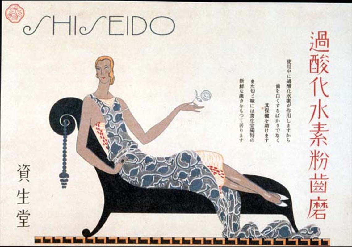
The combination of type and graphical representations of women to communicate a brand’s modernity was certainly not limited to department stores like Mitsukoshi, as Shiseido demonstrates. Conceived as a Western-style pharmaceutical business in 1872 by Fukuhara Arinobu, the company eventually became one of the leading cosmetics companies in Japan a few decades later. The evolution of Shiseido’s brand identity under the leadership of Fukuhara’s son Shinzō from a local, traditional Japanese-heritage brand to one exuding international, modern-luxury quaintly illustrates Japan’s experience of modernity in the first half of the twentieth century. Like Mitsukoshi, Shiseido relied mainly on pictures of women to embody the brand’s values, but in a much more specific way than simply an association with fine art. Both communicate, principally to women, idealizations of modern Japanese identity, however in Shiseido’s case, the message is much more pronounced. While Mitsukoshi’s image comes off as a mere modification of the normative beauty, or in other words the “self,” and stays within those boundaries, Shiseido welds this model with what Ludovic Chatenet calls “a disruptive beauty,” referring to female models identifiable by the Japanese viewer as markedly “other.” Shinzō, having spent several years abroad and inspired by foreign aesthetics, brought back his modern, art nouveau sensibility with the intention of building an “image of luxury, elegance and glamour as a manifestation of the word ‘rich’ used as the core value.” As in the Mitsukoshi example provided previously, Shiseido needed to integrate the “other” while staying within the local visual syntax in order to be read by viewers as intended; in this manner, designers act as translators. Comparing a relatively earlier example of Shiseido’s advertising from 1915 (fig. 5) with one from a few years later in 1923 (fig. 6), the female figure in the former appears distinctly traditional, “reminiscent of the Heian period” while also exhibiting influence of Edo period printing techniques.
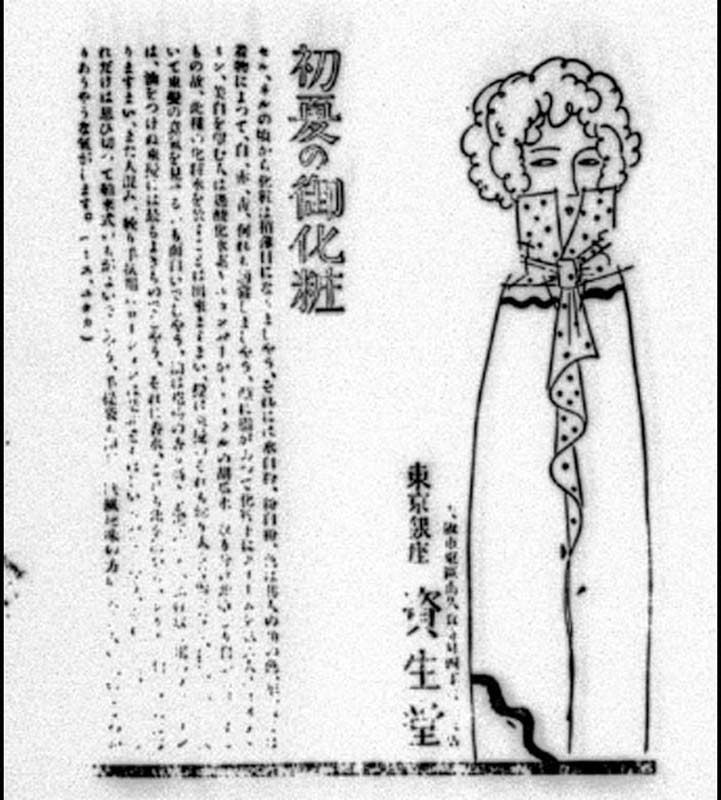
When juxtaposed with the figure in the advertisement from 1923, the telling difference between the two that Chatenet perceptively notes is that “lines give a specific touch to the design...Lines take part in the phenomenon of presence through the control of perception and rhythm...the ‘type’ of woman requires a type of line as much as the type of line will construct a particular type of woman.” The Western woman, identifiable by lighter, curly hair, has been translated by the designer through “figurative construction,” as in by the use of line as well as the cloaking of bodily curves in a kimono-like fashion, allowing her to convey Shiseido’s image of idealized beauty to Japanese consumers, which it promises through its products. One might recall the point made earlier regarding the modernization of the female figure and its relationship to the overarching sense of Japanese national identity, which was concurrently going through a similar process. The hybridization of the woman was both a reflection of this process, as well as a mediator between the “self” and “other” for the Japanese public.
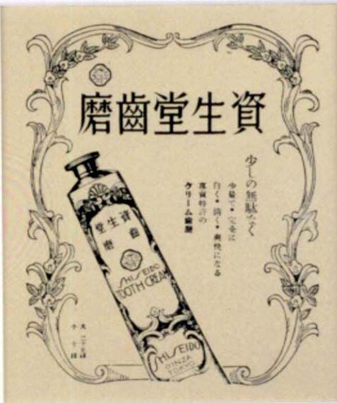
Over time, with greater exposure to Western imagery and visual styles, as well as an increased use of rōmaji letters, brands like Shiseido were afforded greater possibilities with their visual communication as their audience’s visual syntax expanded. Shiseido, in the interest of maintaining its modern, chic image built on “fanciful images of luxury Western lifestyles,” employed a brand name using stylized rōmaji letters that emulate the same elegance and grace embodied by the leisurely female figures that accompanied them (fig. 7). This fresh, modern-looking name would appear on packaging and bottles (fig. 8), both important elements to Shiseido’s overall brand experience. The attention given to packaging stems from old Edo period practices; wrapping paper ornamented with exquisite patterns were recognized for their potential “ongoing promotional effect.” Beautifully designed packaging, given value by the consumer, would be saved. In holding onto it, consumers retain part of the brand experience within their lives. The posh designs of Shiseido’s products, often boasted in advertisements, could decorate a customer’s home, and to the loyal ones, these bottles could accumulate with each purchase forming of a collection. Being bottles, particularly elegant ones, they could also be reused, adding utility through beauty.
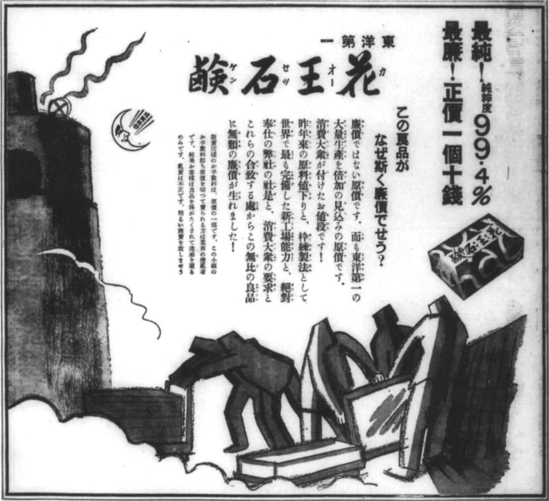
The potential in packaging design was a vital part of Kaō Soap’s brand strategy. Faced with hard financial times brought about by the Depression, the company’s president Nagase Tomirō II decided to revamp the soap brand’s identity. Together with the art director Ota Hideshige, they invited Japan’s premiere design talent to try their hand at redesigning Kaō in 1930. The competition’s prize money attracted many of the top designers in the field at the time, including Sugiura Hisui. The winning design, by then-unknown Hara Hiromu, featured a playful rōmaji script type treatment of the soap’s name on a bright vermillion red background, with a strip along the middle containing the brand name in a combination of kanji and katakana, the latter being one of the two native syllabaries in the Japanese language (fig. 9).
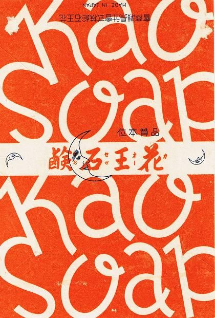
Hara had a vested interest in modern typography and was heavily influenced by Western design, leading him to translate Jan Tschichold’s The New Typography from German to Japanese in 1932. The brand name Kaō Sekken in kanji refers to Chinese poetic tradition, recalling the fragrance of the peony, known as “king of a hundred flowers.” Despite the promising associations such a reference could lend the soap product, the character combination would not have been universally understood: for this reason, the small katakana set vertically next to the kanji letters operate as “phonetic reading marks,” guiding Japanese readers through the word’s pronunciation. Hara’s design, utilizing a very modern style reflected in the typography and color choice, was simple yet complex, but visually striking overall. The large, loopy rōmaji logotype spelling “Kaō Soap” would have appeared foreign and fresh, identifying the brand with the national modernization trend. All the while, it maintains a distinct Japanese aura by embracing its native visual language, deployed in a handful of ways, in addition to the bold red color that subtly suggests, whether or not intentional, the national flag.
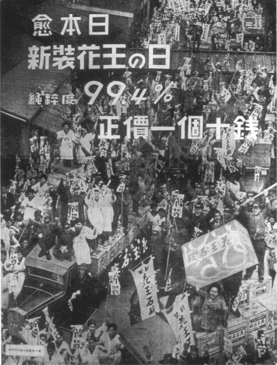
Kaō then poured its resources into the “New and Improved Kaō” campaign hoping to overcome the Depression’s slump by promoting greater soap usage among the working class. Previously, since soap was not a staple among the Japanese nor a part of the general standard of hygiene praxis, Kaō’s marketing aimed at a narrower group of “upper- and middle-class urban women” and positioned its soap as a luxury product. The newly rebranded soap packaging popped up on various poster designs that superimposed the design onto images that tended to involve or imply the working class. The newspaper advertisement that kicked off the campaign shows a lively crowd of Nagase’s employees holding up banners or raising their hands in triumph outside the factory, with an image of the soap bar in its new packaging placed on the bottom-right corner and copy on the top half of the page saying, “Today is the day of New and Improved Kaō, 99.% pure, net price 10 sen apiece,” (fig. 10). The photo, by commercial photographer Kanamaru Shigene, feels reminiscent of the USSR’s propaganda images of social revolution, celebrating the industrial worker as the symbolic building block of the nation; this was no coincidence, considering Nagase had published a rallying cry in the company’s house organ Nagaseman calling all employees to “behave like soldiers in the company fight on the battlefield of the consumer market.” Nagase and Ota’s shared penchant for left-wing politics undoubtedly influenced their approach to the campaign, as reflected in another advertisement using figurative illustrations of industrial laborers by Asuka Tetsuo in 1931 (fig. 11). This connection between commerce and politics should not come as a surprise, since both are deeply invested in “the act of persuasion and the glorification of iconic symbols, in one case of political ideology, in the other, capitalist consumption.” Perfectly illustrating this point, another Kaō advertisement from 1934 appropriates a photograph taken by Willi Ruge in the previous year of a Nazi rally and uses the soap bar to cover up the Nazi swastika (fig. 12). Around this time in the early 1930s, the government’s increasingly right-wing politics were taking root as a greater movement toward nationalism, and “a strong modern military was considered an essential pillar supporting the nation.” Kaō’s advertising aligned with Japan’s imperialist expansion as it continued its efforts to prove itself as a modern global power, culminating in the 1930s with the Second Sino-Japanese War beginning in 1937. As Mitsukoshi, Shiseido and Kaō demonstrate, “modernist pictorial strategies” were being used to “aestheticize new consumer products” and “gain better ‘attention value’ in a competitive emerging national market” in a way that corresponded with Japan’s evolving sense of national identity. These brands were visually bridging the gap for the Japanese public between two self-identities, one stemming from the familiar and traditional, the other representing the strange, impending future.
Japan’s devastating defeat in the Second World War and the subsequent occupation by the American victors brought to light the question of identity in the national consciousness. After years of wrestling with the consequences of its recent history, the country was given the opportunity to reinvent itself on the international stage as the host of the 1964 Olympics. According to Japanese officials, the goal of the Tokyo Games was,” to show the world that Japan is not just a country of cherry blossoms and geishas...[but] to demonstrate that Japan had been rebuilt after the war and...willing to connect itself to the western world.” To divorce its self-image from the Orientalist bias imposed on it by the West while posturing itself as a peer among Western nations, Japan turned to the visual rhetoric of modernist graphic design which, at the time, was based on the pursuit of an abstract, universal style that consciously avoided historicism. As creative director, art and design critic Katsumi Masaru formed a team of all-star contemporary designers who had established their reputation during the pre-war era, including Hara Hiromu, Kamekura Yusaku, and Kōno Tadashi, as well as younger designers such as Tanaka Ikko who would become influential to the next generation of Japanese design. Their “total design” approach to the Olympics branding, the first time this strategy would be used in the Olympics, included creating a “design guide sheet” that provided a framework for how the designs would be deployed to ensure the Games’ brand identity was cohesive throughout the entire experience, from the posters and other printed material to the actual visual environment of the Games. Sugiura Hisui, identified earlier as one of Japanese design’s key initial proponents, introduced the total design strategy of “designing the entire lived environment,” taking his inspiration from European art nouveau designers. The final emblem design, designed by Kamekura with the consultation of typographer Hara, was a symmetrical, vertical composition that placed a large red circle over the five Olympic rings and the words “Tokyo 1964” set in a gold, sans serif typeface at the bottom (fig. 13); it was considered “formally the most modern” of the proposed designs, which had included iconic historical motifs like Mount Fuji, a Japanese fan, and a design reminiscent of mon, traditional Japanese crests that operate similarly to a European coat of arms. In comparison, poster designs for the cancelled 1940 Tokyo Olympics had reflected the neo-traditionalist, pan-Asianist, and self-Orientalizing aesthetics of colonial Japan, a style Gennifer Weisenfeld has identified as embodied by the Japanese travelogue Nippon which was in production around the same time.
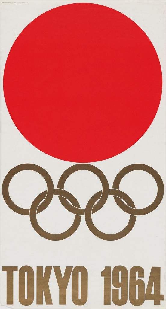
Using the ahistorical language of modernism did not necessarily mean references to the past were completely avoided. Kamekura claimed his choice of the red circle was due to an interest in the color’s symbolism for the international excitement for the Games, as well as the circle’s formal similarity to the Olympic rings, but admitted that its interpretation would rest on the viewers; for the non-Japanese, he thought it would resemble the sun, while among his fellow countrymen, it would remind them of their flag. The Olympic organizers exemplified this interpretation in expressing their gratitude for the “renewed appreciation of the Rising Sun’s dynamic simplicity,” after its association with Japan’s actions in the wartime era. Aside from the allusion to the national flag, Kamekura found additional inspiration in Japan’s mon crest design tradition. He and Katsumi appreciated the consistency and simplicity of mon designs that made them “intelligible by the wider public,” and their use of a strong “central image” composition that concentrates attention into a single focal point. Thus, the international acceptance of a classical Japanese national symbol in the branding of the 1964 Olympic Games marked the reclamation of a national identity that had been tarnished by Japan’s militarism and defeat in World War II.
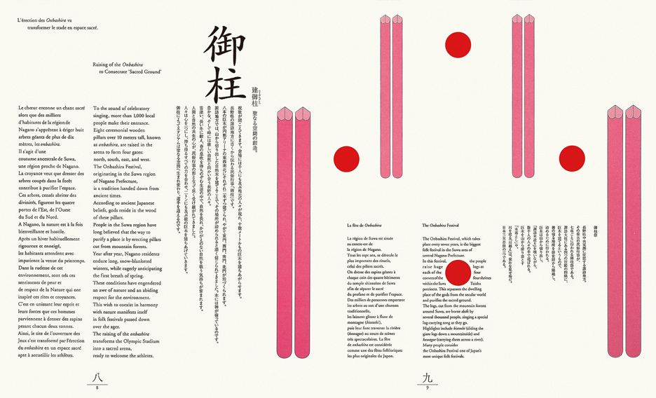
The Japanese design team also acknowledged the international nature of the Olympic Games as an opportunity to address the broader issue of visual language and communication in Japan. Throughout the twentieth century, the Japanese had been debating over the standardization of their polyglot written language, with some arguing for abolishing kanji and vertical typesetting, or even switching the Japanese language’s horizontal orientation from right-to-left to the Western convention of left-to-right due to the association with modernity. Although modernism was preferred for its seemingly anti-historicist conventions, it should be noted that important Western figures such as Bruno Taut and Frank Lloyd Wright felt the Japanese visual tradition “carried formal affinities with the principles of modern design.” In fact, the free-form directionality that Japanese letterforms permit, as the Kaō rebranding displays, only entered Western typographic design through the experimentations of modernism. This debate extended to the design of the 1998 Nagano Olympics promotional material when the Japanese committee, in keeping with the theme of internationalism, could not decide whether to print the Japanese type in the trilingual program horizontally or vertically. Hara Kenya’s final design solution maintained the internationalist intent while thoroughly embracing tradition by balancing the horizontal rōmaji type and the vertical kanji with additional pictorial elements that referred to Nagano’s centuries-old pillar-raising ceremony that had been incorporated into the Games’ opening ceremony (fig. 14). In the designs of both Games, Japanese designers skillfully preserved nationalism and modernism without resorting to the sterilization of tradition. Kamekura confessed that tradition is “a burden for designers,” but one that cannot be denied; the task for Japanese designers is to “deconstruct, and rebuild [their] tradition.” Furthermore, they demonstrated that modern Japanese design need not abandon its heritage, which indeed would prove essential to its recognition as distinctly Japanese by both a domestic and international audience.
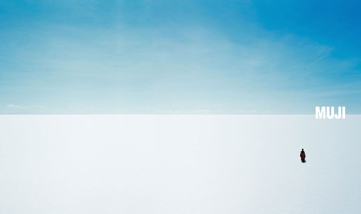
The torch these pioneering Japanese designers used to light the way has since been passed on to the next generation. Hara Kenya received his position as art director for the Japanese retail company MUJI from the late Tanaka Ikko who had served as the company’s first art director and had also worked on the 1964 Tokyo Olympics as part of the design team. Hara felt it was his responsibility to “empower” MUJI’s original concept “to meet today’s global context, in which a wiser way of dealing with manufacturing, resources and the environment has begun to arise. No longer a localized experiment, MUJI is now a practical project operating within the global consumer culture.” Japanese design, once “engulfed in the industrial momentum toward the commitment to standardization and mass production,” is now facing the challenges of globalization. In a global economy, led by the West, that “runs on the fuel of capital and appetite,” Hara’s response has been to focus on the satisfaction that simple, quality design affords. using MUJI as a vehicle. He believes that, in the face of the immense environmental issues brought about by globalization, contemporary Japanese society should challenge the status quo imposed by the Western mode of consumerism “by asking, ‘How should we live in the postmodern era?’” In his approach to the company’s brand strategy, Hara emphasizes the concept of “emptiness” to accommodate the variety of expectations customers ascribe to the MUJI brand. Taking a page out of Kamekura’s book, Hara uses the Japanese national flag as an example for how a brand operates: “the red circle in the center carries no meaning. It’s just a geometric figure. People supply the meaning...At the Olympic Games and other such occasions...it is nearly overflowing with the multitude of meanings, both positive and negative, attributed to it by the masses of spectators.” For MUJI’s 2003 ad campaign, Hara worked with photographer Fujii Tamotsu to capture epic images of perfectly flat horizon lines that included only the smallest representations of humanity. The final poster designs simply superimposed the MUJI logo onto the photos, off to the side (fig. 15). The images of seemingly infinite, abstracted landscapes invite viewers to ponder the significance and scale of nature, whose wellbeing is inextricably linked to the wellbeing of humanity. Without any copy aside from the brand name, the images suggest a relation between MUJI and its values of simplicity, universality and sustainability while leaving room for additional interpretations. Through the MUJI brand, Hara posits the notion that Japanese design, and design in general, can elevate the taste of the global market. MUJI’s products are designed with its domestic consumers in mind, but extends its offerings to the worldwide marketplace in the hopes of inspiring consumers abroad: its product design philosophy is informed by the limited space and resources available in the small island nation of Japan, a metaphor for the planet at large.
To Hara, “Design is the vocation of taking both old and new media, favoring neither, putting them into a cross-disciplinary perspective, and making full use of all.” As all these Japanese designers have demonstrated, Japan’s rich cultural heritage and unique history yield inexhaustible wellsprings of inspiration for modern design. Tradition provides “a vantage point that allows us to see not the near future...but the whole of time, reaching from the past to the present and then on a bit,” to the future that lies way ahead. The nature of visual communication and brand design, as they have unearthed through their work, is that such communication is a two-way street. The brand presents itself to the public, and the public then communicates back with its own interpretations. The designers, as facilitators for this dialogue, must be conscious of the societal context under which their designs will exist. By preserving their national identity in their design, Japanese designers validate their cultural significance on the international stage. Japan’s contribution to global design culture can be summed up by Hara’s own words:
My remarks indicate neither intolerance nor petty nationalism...because of [our] global perspective, we must face the world and boldly assert our localism. We don’t need to lose our individuality to become global. In the global context, distinction is valuable. As long as we know the world and remain our original selves, we’re fine.
Bibliography
Chatenet, Ludovic. “Brand Design: Identity and Cultural Mediation.” The Design Journal 19, no. 2 (June 2016): 353-372. Accessed April 12, 2017. http://dx.doi.org/
Fraser, James, Steven Heller, and Seymour Chwast. Japanese Modern: Graphic Design Between the Wars. San Francisco: Chronicle Books, 1996.
Hara, Kenya. Designing Design. Translated by Maggie Kinser Hohle and Yukiko Naito. Baden: Lars Müller Publishers, 2014.
Hiesinger, Kathryn B., and Felice Fischer. Japanese Design: A Survey Since 1950. Philadelphia: Philadelphia Museum of Art, 1994.
Pekarik, Andrew. “Japanese Design: A Survey Since 1950.” Review of Japanese Design: A Survey Since 1950, by Kathryn B. Hiesinger and Felice Fischer. Philadelphia Museum of Art, Philadelphia. Design Issues 11, no. 2 (1995): 71-84.
Thornton, Richard S. “Japanese Posters: The First 100 Years.” Design Issues 6, no. 1 (1989): 4-14.
Traganou, Jilly. “Tokyo’s 1964 Olympic design as a ‘realm of [design] memory.’” Sport in Society 14, no. 4 (May 2011): 466-481.
Weisenfeld, Gennifer. “From Baby’s First Bath: Kaō Soap and Modern Japanese Commercial Design.” Art Bulletin 86, no. 3 (September 2004): 573-598.
Weisenfeld, Gennifer. “Japanese Modernism and Consumerism: Forging the New Artistic Field of ‘Shogyo Bijutsu’ (Commercial Art).” In Being Modern in Japan: Culture and Society from the 1910s to the 1930s, edited by Elise K. Tipton and John Clark, 75-98. Honolulu: University of Hawai’i Press, 2000.
Weisenfeld, Gennifer. “Japanese Typographic Design and the Art of Letterforms.” In
Bridges to Heaven: Essays on East Asian Art in Honor of Professor Wen C. Fong, 827-848. Princeton: Princeton University Press, 2011.
Weisenfeld, Gennifer. “Selling Shiseido: Cosmetics Advertising & Design in Early 20th Century Japan.” MIT Visualizing Cultures. Accessed April 12, 2017. https://ocw.mit.edu/
Weisenfeld, Gennifer. “Touring Japan-as-Museum: Nippon and Other Japanese Imperialist Travelogues.” Positions 8, no. 3 (Winter 2000): 747-793.